12.9.14

Hadoop/Spark and RoR Summer Adventures

I worked at the Pittsburgh Supercomputing Center (PSC) over the summer during an internship sponsored by XSEDE. I also juggled helping my 67-272 (Application Design and Development) professor fix/polish an existing Ruby on Rails (RoR) project.

Whew! That's a lot of acronyms. Expect more coming.

PSC XSEDE: A dip into BigData


My goal for the internship was to utilize log data about a large webserver named the 'Archiver.' Like most log data, it wasn't being analyzed, just being collected.

This powerpoint I created for my presentation about this project @ the XSEDE'14 Conference summarizes things nicely.

But to go more into detail...I used Hadoop to store cleaned logs. Hadoop allows multiple machines/nodes to act as if it are a single machine, in a sense. I took advantage of the HDFS (Hadoop Distributed File System). Instead of writing a mapReduce function, I ran Spark on top of the Hadoop cluster. Spark allowed me to utilize data inside of the HDFS and conveniently create large in-memory data structures called RDDs (Resilient Distributed Datasets) which I could perform repeated tasks on. Spark also came with a machine learning library module that could be applied onto RDDs.
Data flow @ the PSC for my project
The challenges I bumped into are common for anything 'BigData.' One was getting access to data, and subsequently having to learn my way around the OpenTSDB API (Open Time Series Database). Another was cleaning said log data. I wrote a python script that would query the OpenTSDB, create a CSV, and then place it into the HDFS. I ran this script once a day via crontab. Then there was the problem of incorrectly setup collectors - that had to be amended as well. Of course, bugs were to be expected too.

Collection and cleaning took a substantial chunk of my time. When I had enough data in the HDFS, I moved onto using K-means clustering to examine the data. K-means is a commonly used machine learning algorithm which locates n centoids and matches your datapoints to 'closest' centoids. It allows you to find relationships between dimensions (i.e. filereads vs. CPU) and more! My project's data looked at 5 dimensions about the Archiver: filereads, filewrites, net IO, CPU, and disk IO.

The final step was visualizing the results. For this, I decided to use d3, a javascript library that can visualize documents on the web. The user could change what dimensions he/she wanted to view at a time. Here's what came out of early analysis (shown only on 2 dimensions):
White points are centoids. Colors determine 'area of influence.' If it looks like some centoids have more than others, it's cause other dimensions that aren't being displayed are influencing....
For the last few steps, I was working on making it possible to call the Spark K-means script from the web page and update what was viewed.

My experience at the PSC was overly positive. I got great working experience using Hadoop, Spark, python, d3, javascript, OpenTSDB, and machine learning algorithms. Definitely challenging but greatly rewarding - and I can tell what I've learning will be useful in the years to come.

>> Github repo to most of code

A poster made for XSEDE'14 and Duquesne Presentations. Take a look!


FamilyTyes: A RoR rollercoaster

This is a project still in motion. It started at the beginning of summer. A previous (and now separated) team worked to create a web application for the organization, FamilyTyes. This site was to record attendances, keep track of quiz data, and visualize said data. It was to help the organization prove that it had a STEM impact on those enrolled in its classes.

When I came, the site was already very made...in a sense. The backend was quite solid. The frontend, maybe not so much.

BEFORE:
The site as I saw it for the first time. Deployed too
There was a plan to give every student enrolled with FamilyTyes an ID card, and scan said cards to access the system. Cool, but maybe not quickly applicable. So instead, the professor and I decided to make the site mobile friendly (teens have smartphones, right?) and modify the way the whole quizzing process occurred.
That's not good.
Several issues. Current site was not mobile friendly, at all. Also, at some point the site was using Bootstrap, but then switched to foundation. Foundation was not installed as a gem, but rather being loaded in multiple times in many areas. TLDR; this project's views needed a lot of love.

I decided to make the site resemble FamilyTye's home site, otherwise no one would know that the two sites were closely associated. To make it mobile friendly, I created two views - one for mobile, one for web - through the tools foundation provided me. I also have some AJAX here and there to make taking role, etc. faster and more logical.

The new mobile homepage, nav in top left.
You can actually look at the site now @ http://ftdev.info/

Since this is a WIP and for FamilyTyes, I don't want to go any further. At least, until the site is officially released! We want to use the system with kids at the Baldwin High School starting in October. Let's hope that goes well! ; )


1.5.14

cAPP and HCI

I got into CMU's undergraduate HCI double major program! This happened awhile ago, sorry for the late update.

In the meantime, enjoy this bit of work I did is for an entrepreneurship class midterm group project (what a mouthful). What we came up with was 'cAPP,' a fit-all drug cap that would sense when the bottle was opened and sync with a smart phone application which keeps track of your medical schedule. Here are some of the rough mocks I did for the presentation that illustrate its function.
Sophomore year is nearly over. Just one more week of finals / projects, and I'll be done! Expect to see more work posted here once that happens.

On a tangent, I'll be working in Pittsburgh this summer. I've gotten a research opportunity at Pittsburgh Super Computing (PSC) and hopefully, will also be able to help a professor with some research. Looking forward to a productive break until junior year...

15.1.14

IS Milieux - Bikes...And POS?

This is a team project I contributed on during the fall semester. We designed and then prototyped a touch-enabled tablet point of sales (POS) system for an imaginary bike company called "Overmoyer." It is meant to be held by salespeople to assist in presenting products, registering customers, and processing transactions. It could also be considered a tool for customer relationships as well then.

 I'm lucky to have worked with such friendly and talented people! Our project ended up winning the "ISM Best Overall" in the class. Hooray for more mugs, chocolate, and certificates to bring back home.

I'll show you guys just what I worked on. Anything I don't mention was coded/designed by one of my teammates. They're seriously awesome.


Tablet is in landscape view. I wireframed the area you see on the right and created the mockup rating icons...And wrote the text! The bikes on the left and font choice was a more universal aspect of the POS system and was not designed/chosen by me.

The Felt Jetty bike description page. Now in portrait mode! 

This project marks my first exposure to using source code management (git). It was a confusing but interesting ride, and I'll only continue using such procedures. 67-272, a class I'm taking now, has my head all up in ruby, rails, git, and a slew of klingon language. More on that later. Instead, have this logo I made for the POS team project!

We named our team "Global Eucalyptus Consulting." Hence the magical eucalyptus leaf, soon to take over the world with the power of technology.


5.12.13

Visualizing Complex Information - Imaginary Book

A bit of a delayed update, but here's some work from a class I took during the first half of this semester. It's called 67-260: Visualizing Complex Information, taught by the amazing Karen Berntsen. It's main focus was on getting us comfortable with visual hierarchy. We had a single project that just kept expanding...So, to start at the beginning, we were given this mass of text and tasked with organizing it into meaningful categories.

Everyone came up with different categories, since our professor didn't give us very precise directions (on purpose). After that, we had to organize the categories into a mock table of contents for a made up book.
Next, we then had to make a mock poster advertising the fake book! Although my classmates were given the same image resources to draw upon, I was the only to use this image of a lake as "Earth."
Finally, the last task was turning everything into a mock mobile app and website. The visual theme had to remain consistent, so I stuck with my black and white (plus blue/green) color scheme. Here's what I came up with in the end:


Keep in mind, all this was done in a very short amount of time. Total class time was 8 weeks, with maybe 6 of those weeks being actual "go" time.

11.10.13

Andy Warhol and CMU

For the class 67250 (Information Systems Milieux) has been mostly about about IS strategy and frameworks for development/organization/etc so far.

That's why I am excited about our current assignment! In two weeks, I have to organize, design, and code a full website about a fictional exhibition at Miller Gallery about Andy Warhol.
Random trivia of the day: the artist graduated from CMU!

It's been awhile since I've gotten my hands dirty with HTML and CSS (and maybe even Javascript this time) so coding is the challenging part. Designs, however, were quickly finished. I've decided to devote most of my time on this project coding, so there are the only wireframes I'll do. They were all made yesterday, in a matter of a few hours.


I wanted the site to be connected to Andy Warhol from a quick glance. We were given his earlier works to "showcase" in the exhibition however. So there was the issue of a user going to the site and not realizing it is about Andy Warhol.

I solved the issue by making the overall look of the site resemble on of Warhol's most famous works. Do you know which one it is?
Answer: http://www.moma.org/collection_images/resized/222/w500h420/CRI_159222.jpg

1/15/14: I've uploaded my project to github! https://github.com/angelamuliu

24.9.13

Blue Stars Web Design

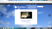
Another project I worked on over the summer was redesigning the website for Blue Stars Consulting. Blue Stars Consulting (and its amazing founder, Dr.M) helped me back in my high school days during the college application process. So when I was given the opportunity to give back in regards to updating their website, I pounced on it right away. As an added bonus, I've learned quite a bit on the way! Here are some work in progress mock ups I've done, since things are ongoing.

The start of it all - so boxy!


This isn't the most recent, but I think it's a good place to leave off.

19.9.13

Dentistry Delivery (Part 2)

I continued to keep working on dentistry logos for quite a bit. A whole lot of reworking. The first batch (see "Slices of Summer") helped us determine a theme. Here are my explorations into that theme.

Brainstorming, part 2!

A friendly poke becomes a viable logo

Refining that subtle toothbrush design

 There's a lot I just don't have room to show. I tried to show the highlights! (The final design I submitted to my client isn't even shown here) Here's just one of many more in-depth adjustments I made to a logo that almost made it to the end.
But which wiggle looks best?
Also, update on Kaylune (http://www.kaylune.com/). We've opened Closed Beta and have been testing vigorously with our beta users. It'll close on Nov. 1, and then that's when the real work starts. All I can say is that there are exciting developments! I'm loving the direction we're going in.