5.12.13

Visualizing Complex Information - Imaginary Book

A bit of a delayed update, but here's some work from a class I took during the first half of this semester. It's called 67-260: Visualizing Complex Information, taught by the amazing Karen Berntsen. It's main focus was on getting us comfortable with visual hierarchy. We had a single project that just kept expanding...So, to start at the beginning, we were given this mass of text and tasked with organizing it into meaningful categories.

Everyone came up with different categories, since our professor didn't give us very precise directions (on purpose). After that, we had to organize the categories into a mock table of contents for a made up book.
Next, we then had to make a mock poster advertising the fake book! Although my classmates were given the same image resources to draw upon, I was the only to use this image of a lake as "Earth."
Finally, the last task was turning everything into a mock mobile app and website. The visual theme had to remain consistent, so I stuck with my black and white (plus blue/green) color scheme. Here's what I came up with in the end:


Keep in mind, all this was done in a very short amount of time. Total class time was 8 weeks, with maybe 6 of those weeks being actual "go" time.

11.10.13

Andy Warhol and CMU

For the class 67250 (Information Systems Milieux) has been mostly about about IS strategy and frameworks for development/organization/etc so far.

That's why I am excited about our current assignment! In two weeks, I have to organize, design, and code a full website about a fictional exhibition at Miller Gallery about Andy Warhol.
Random trivia of the day: the artist graduated from CMU!

It's been awhile since I've gotten my hands dirty with HTML and CSS (and maybe even Javascript this time) so coding is the challenging part. Designs, however, were quickly finished. I've decided to devote most of my time on this project coding, so there are the only wireframes I'll do. They were all made yesterday, in a matter of a few hours.


I wanted the site to be connected to Andy Warhol from a quick glance. We were given his earlier works to "showcase" in the exhibition however. So there was the issue of a user going to the site and not realizing it is about Andy Warhol.

I solved the issue by making the overall look of the site resemble on of Warhol's most famous works. Do you know which one it is?
Answer: http://www.moma.org/collection_images/resized/222/w500h420/CRI_159222.jpg

1/15/14: I've uploaded my project to github! https://github.com/angelamuliu

24.9.13

Blue Stars Web Design

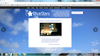
Another project I worked on over the summer was redesigning the website for Blue Stars Consulting. Blue Stars Consulting (and its amazing founder, Dr.M) helped me back in my high school days during the college application process. So when I was given the opportunity to give back in regards to updating their website, I pounced on it right away. As an added bonus, I've learned quite a bit on the way! Here are some work in progress mock ups I've done, since things are ongoing.

The start of it all - so boxy!


This isn't the most recent, but I think it's a good place to leave off.

19.9.13

Dentistry Delivery (Part 2)

I continued to keep working on dentistry logos for quite a bit. A whole lot of reworking. The first batch (see "Slices of Summer") helped us determine a theme. Here are my explorations into that theme.

Brainstorming, part 2!

A friendly poke becomes a viable logo

Refining that subtle toothbrush design

 There's a lot I just don't have room to show. I tried to show the highlights! (The final design I submitted to my client isn't even shown here) Here's just one of many more in-depth adjustments I made to a logo that almost made it to the end.
But which wiggle looks best?
Also, update on Kaylune (http://www.kaylune.com/). We've opened Closed Beta and have been testing vigorously with our beta users. It'll close on Nov. 1, and then that's when the real work starts. All I can say is that there are exciting developments! I'm loving the direction we're going in.

5.8.13

Slices of Summer

Here's a taste of what I've been doing this summer, and there is quite a variety. Expect another update sometime later (as some work I have done cannot be shown yet - it would ruin the surprise!)

Initial logo work for family dentistry


Main world map for Kaylune

12.5.13

Retrograde - Enemy and Conclusion

This is a little belated, but work on Retrograde has finished this semester! Though intended to be a one semester project, the team (including me) has expressed interest in polishing the game a bit more over summer and perhaps next year. We'll see.

We ended up winning some sort of club award for the game, netting each of the teammates a 20$ steam wallet gift card, sponsored by Schell Games. Kudos to everyone! :D

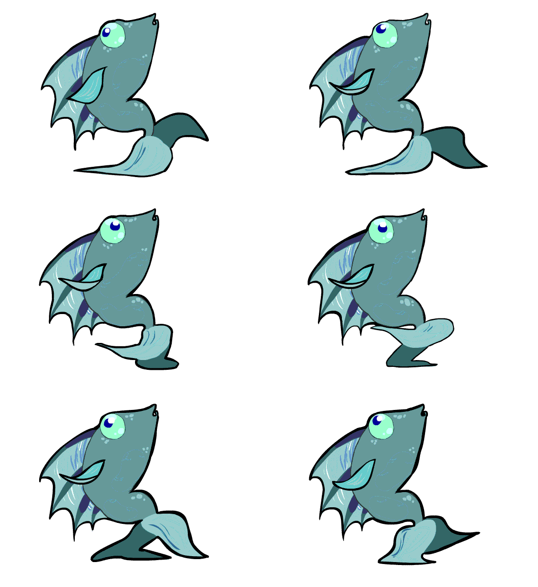
Anyway, here's another enemy that was created for the water cave levels of the game. It's pretty silly:

You can play a version of the game here! Have fun!
http://ncroses.com/retrograde/

29.4.13

15112 (S13) Term Project: Herd Run


This is my term project for 15112 @ CMU. I used python 2.7.2 and pygame 1.9.2 to create Herd Run, a fun action game with strategic elements mixed in! The goal is to reach the next point goal in order to move on to the next level. Points are earned by dropping cows into a pen area.


UI, images, and sound effects by me! This project took ~50-60 hours.
Music > Bits of Happiness: Andersson187 @ Newgrounds (licensed under CC)

Thank you for watching!

1/15/14: I've uploaded my project to github! https://github.com/angelamuliu

1.4.13

Retrograde - Enemy concepts

At CMU, I'm part of the GCS (game creation society) and currently working on a project called 'Retrograde,' a planned PC platformer themed around going backwards. This guy is a one of many monsters blocking the player from reaching his/her goal! Animated in flash.
Check out these concepts that led to the creation of the lava slug though!


21.3.13

Kaylune - Logo Design Final


And so, Kaylune's logo is finally complete! Working with vectors was tough at first, but as I got closer to finishing, everything felt more natural. After meeting with the owners after presenting the second image, they gave me some pointers (wanted world in background, thought letters looked messy) and I worked with them.
The final product is the last image. Purposely small, to protect the image from being misused on sites without permission.

6.3.13

EcoCarnival - the end...for now!

Just making a short post about the resolution of the "EcoCarnival" proposal!
Our team was given around 3 weeks to draft the proposal, create the website, and design the poster (on top of everything else). It was challenging at points, the most challenging aspect being organizing work and assigning tasks. But in the end, we came up with a high-quality and creative proposal...that ended up winning the most innovative award out of the class (yay, free hats for the team!).

I wish I could show you the poster, but we turned it in. :(

But here's the great website, courtesy of Ian: http://iango3.wix.com/theecocarnival

19.2.13

IS Project - mock games #2 & 3 + Start


The rest of mock app games created for IS project!


12.2.13

IS Project - mock game #1


For an IS project, a team of us have to come up with a proposal raising sustainability/environmental awareness using some sort of information system. Ours targets youth (age 3-8) and teaches them good green habits early on! Here's a mock of one such game about..turning off lights.
I think it'd be fun!